Correspondence Analysis visualization using ggplot
What we want to do
Recently, I used a correspondence analysis from the ca package in a paper. All of the figures in the paper were done with ggplot. So, I wanted the visualization for the correspondence analysis to match the style of the other figures. The standard plot method plot.ca() however, produces base graphics plots. So, I had to create the ggplot visualization myself. Actually, I don’t know if there are any packages that take a ca object (created by the ca package) and produce ggplots from it. I found this website but it uses the FactoMineR/factoextra package to do and visualize the correspondence analysis.
So, off we go… let’s build our own ggplot-based visualization for ca objects.
Getting the data
I’m going to demonstrate this using data from a linguistic experiment. You could also use, for example, the HairEyeColor dataset that comes with R. In this case, you’ll have to select a specific sub-table, e.g. HairEyeColor[,,"Female"], to get a 2-dimensional table.
Let’s start by loading the data. You can get it from my Dropbox. It’s a 2-dimensional table with 3 rows and 7 columns. This was an association experiment in German and the task of the participants was to associate several items of three different linguistic constructions (rows) to different media or text types (columns). I will not deal with conceptual difference between media and text types here.
struc.assoc <- readRDS("LangStrucAssoc.Rds")This is the table.
| Text mess. | Voice mess. | Newspaper | Soc.Netw. | Letter | Other | ||
|---|---|---|---|---|---|---|---|
| V-final | 157 | 125 | 114 | 190 | 112 | 147 | 23 |
| V2 | 175 | 210 | 14 | 80 | 128 | 39 | 15 |
| Ellipsis | 293 | 128 | 6 | 43 | 152 | 12 | 12 |
I’ll briefly explain what the rows and columns mean. In the rows, there are three different constructions.
- V-final: As you might know, in Standard German, the finite verb is put at the end of dependent subclauses. We presented “because”-clauses, and this is how such a sentence would look like in Standard German: “Er mag sein Auto, weil es sparsam ist.” (He likes his car, because it economical is.).
- V2: If you are an English speaker, you might be more familiar with this construction. It is not considered written Standard German but it is OK to use it in spoken language. V2 means that the finite verb goes at the second position in the dependent subclause: “Er mag sein Auto, weil es ist sparsam.” (He likes his car, because it is economic.)
- Ellipsis: This sounds very colloquial but most people would understand what you mean. In the ellipsis construction we used, we simply dropped the verb altogether: “Er mag sein Auto, weil sparsam.” (He likes his car, because economic.)
Now, each participant was presented nine of such sentences (three per construction) and had to check which of the media/text types they think it could appear in. We included some media that are clearly more prone to written Standard German than others (like the newspaper or a letter). “Soc.Netw.” (social networks) was maybe a bit underspecified from our side. There are a lot of different social networks and each community has its own “writing style” (at least one!). But we’ll see, where the correspondence analysis puts this item.
Correspondence analysis
I’ll do a simple ca() and will plot the result while I’m also saving the plot object in the variable ca.plot.
library(ca)
ca.fit <- ca(struc.assoc)
ca.plot <- plot(ca.fit)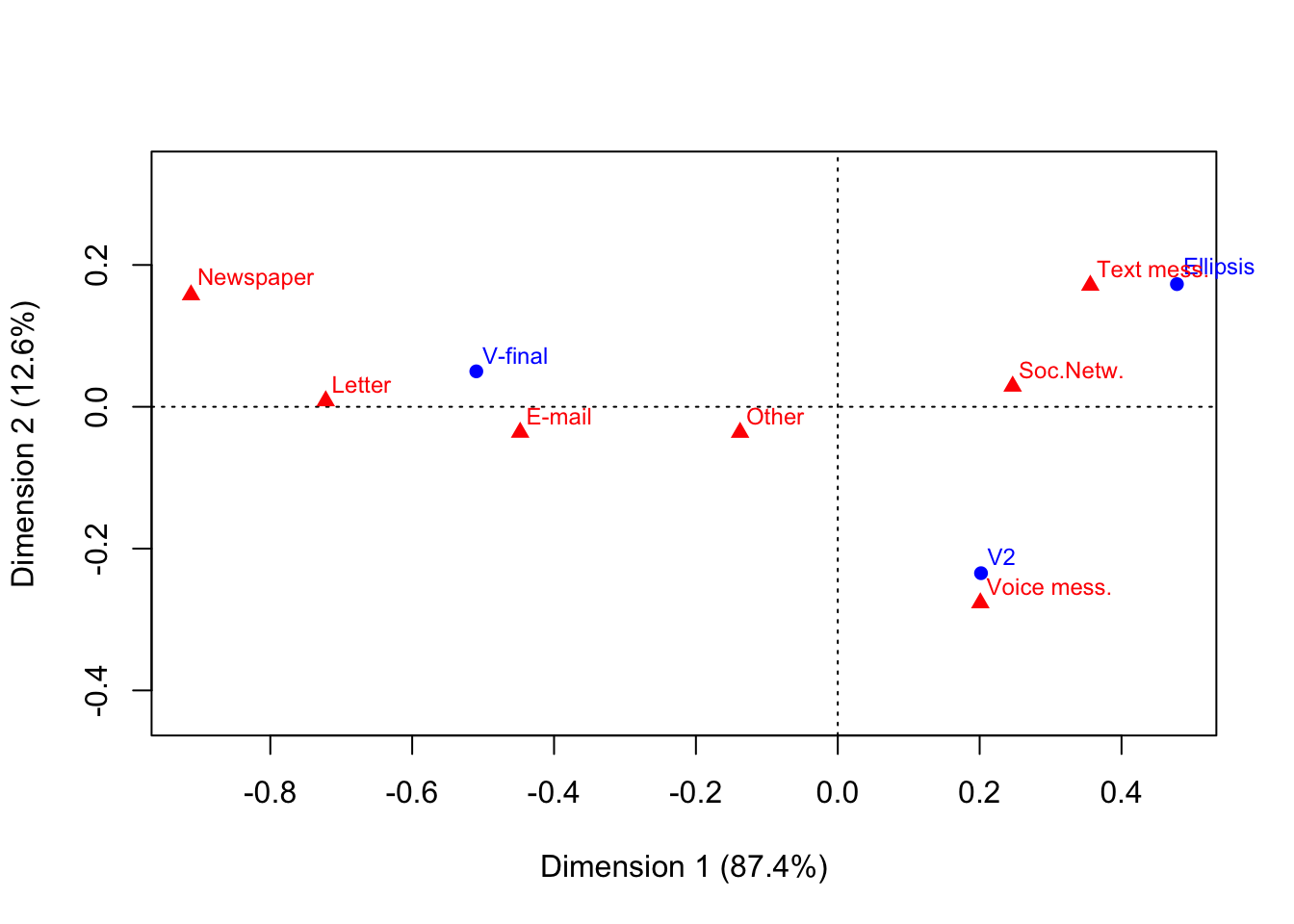
As you can see, (almost) all the information we need is in the plot object.
str(ca.plot)## List of 2
## $ rows: num [1:3, 1:2] -0.51 0.202 0.478 0.05 -0.235 ...
## ..- attr(*, "dimnames")=List of 2
## .. ..$ : chr [1:3] "V-final" "V2" "Ellipsis"
## .. ..$ : chr [1:2] "Dim1" "Dim2"
## $ cols: num [1:7, 1:2] 0.356 0.201 -0.912 -0.448 0.247 ...
## ..- attr(*, "dimnames")=List of 2
## .. ..$ : chr [1:7] "Text mess." "Voice mess." "Newspaper" "E-mail" ...
## .. ..$ : chr [1:2] "Dim1" "Dim2"Only the variance contributions for the dimensions are missing. I will get them from the original ca.fit object later.
Converting the plot object
For ggplot, we will need a dataframe with the labels, the coordinates for the two dimensions and the name of the variable which is stored in rows and columns. The following function make.ca.plot.df() converts the plot object (parameter ca.plot.obj) into such a dataframe. If you want, you can put the variable names for rows and columns as arguments row.lab and col.lab. These are used in the legend later.
make.ca.plot.df <- function (ca.plot.obj,
                             row.lab = "Rows",
                             col.lab = "Columns") {
  df <- data.frame(Label = c(rownames(ca.plot.obj$rows),
                             rownames(ca.plot.obj$cols)),
                   Dim1 = c(ca.plot.obj$rows[,1], ca.plot.obj$cols[,1]),
                   Dim2 = c(ca.plot.obj$rows[,2], ca.plot.obj$cols[,2]),
                   Variable = c(rep(row.lab, nrow(ca.plot.obj$rows)),
                                rep(col.lab, nrow(ca.plot.obj$cols))))
  rownames(df) <- 1:nrow(df)
  df
}
ca.plot.df <- make.ca.plot.df(ca.plot,
                              row.lab = "Construction",
                              col.lab = "Medium")
ca.plot.df$Size <- ifelse(ca.plot.df$Variable == "Construction", 2, 1)
I also want the points for the three constructions to be bigger than the points for the different media/text types. This is why I included the last line in the code chunk above. Please note that the numbers we supplied for sizes (2 and 1) are not the actual sizes of the points in the plot. These are simply two values that are mapped on the size scale later.
ca.plot.df looks like this now.
| Label | Dim1 | Dim2 | Variable | Size |
|---|---|---|---|---|
| V-final | -0.5095947 | 0.0499651 | Construction | 2 |
| V2 | 0.2019318 | -0.2346586 | Construction | 2 |
| Ellipsis | 0.4780980 | 0.1729715 | Construction | 2 |
| Text mess. | 0.3559765 | 0.1712304 | Medium | 1 |
| Voice mess. | 0.2009605 | -0.2765821 | Medium | 1 |
| Newspaper | -0.9117981 | 0.1577468 | Medium | 1 |
| -0.4478077 | -0.0360625 | Medium | 1 | |
| Soc.Netw. | 0.2465235 | 0.0289500 | Medium | 1 |
| Letter | -0.7218847 | 0.0083225 | Medium | 1 |
| Other | -0.1377860 | -0.0361663 | Medium | 1 |
Getting variances
ca.plot.df is already fine for plotting. Only the variance contributions of the two dimensions are missing. We can get them from the summary() of the ca.fit object. If you want, you can do str(ca.sum) to see what is held in this object and how to access the contribution values.
ca.sum <- summary(ca.fit)
dim.var.percs <- ca.sum$scree[,"values2"]
dim.var.percs
## [1] 87.35737 12.64263That worked. These values are the ones plotted next to the dimension labs in the base graphics plot above.
Plotting
Now for plotting. I’ll start by declaring the aesthetic mappings, the dashed lines for x = 0 and y = 0, and putting in the points.
library(ggplot2)
library(ggrepel)

p <- ggplot(ca.plot.df, aes(x = Dim1, y = Dim2,
                       col = Variable, shape = Variable,
                       label = Label, size = Size)) +
  geom_vline(xintercept = 0, lty = "dashed", alpha = .5) +
  geom_hline(yintercept = 0, lty = "dashed", alpha = .5) +
  geom_point()
Now, this is going to be a little complicated. With the limits argument of scale_[x/y]_continuous, I want to make the plot region a little bigger than the range of the points. I’m doing this by getting the ranges of the dimensions (Dim1 for x, and Dim2 for y). To these I am adding and subtracting a fraction (here: 0,2) of the distance between the minimal and the maximum value.
With the scale_size() component, I am controlling how small the smallest label and how large the largest label will be. People helped me with this in this stackoverflow question. Cheers!
Then, I am adding the labels that are automatically being repelled from each other and the data points. I played around with the parameters here to achieve a nice result. With the guides() component, I am overriding the size scale for the legend because I want the points to have different sizes in the plot but not in the legend.
p <- p +
  scale_x_continuous(limits = range(ca.plot.df$Dim1) + c(diff(range(ca.plot.df$Dim1)) * -0.2,
                                                         diff(range(ca.plot.df$Dim1)) * 0.2)) +
  scale_y_continuous(limits = range(ca.plot.df$Dim2) + c(diff(range(ca.plot.df$Dim2)) * -0.2,
                                                         diff(range(ca.plot.df$Dim2)) * 0.2)) +
  scale_size(range = c(4, 7), guide = F) +
  geom_label_repel(show.legend = F, segment.alpha = .5, point.padding = unit(5, "points")) +
  guides(colour = guide_legend(override.aes = list(size = 4)))
OK, almost there. The last thing to do is to define all the labels and setting a theme (I like theme_minimal()). Please note that for the labels of the axes, I am using the object dim.var.percs we constructed from the summary of the fit above.
p <- p +
  labs(x = paste0("Dimension 1 (", signif(dim.var.percs[1], 3), "%)"),
       y = paste0("Dimension 2 (", signif(dim.var.percs[2], 3), "%)"),
       col = "", shape = "") +
  theme_minimal()
plot(p)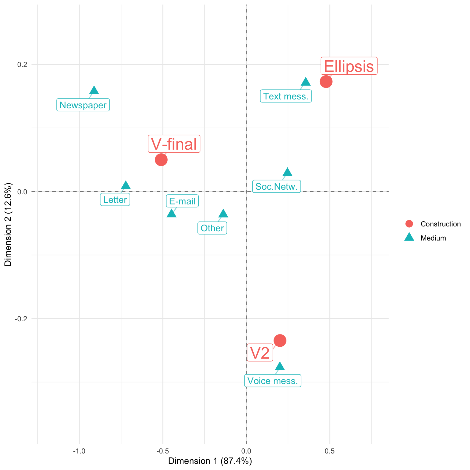
That’s basically it. Interpreting the results in not witin the scope of this post. In short: You can see how text messages are in proximity of the ellipsis construction (presumably because text messages are strongly associated with shorter texts). Also, newspapers, letters, and e-mails are associated with the written Standard German construction. The only medium that is associated with V2 (the “spoken” construction) is indeed the only spoken medium (voice message).