strava

Revisited: Animating 2020 running goals - and compare them with previous years

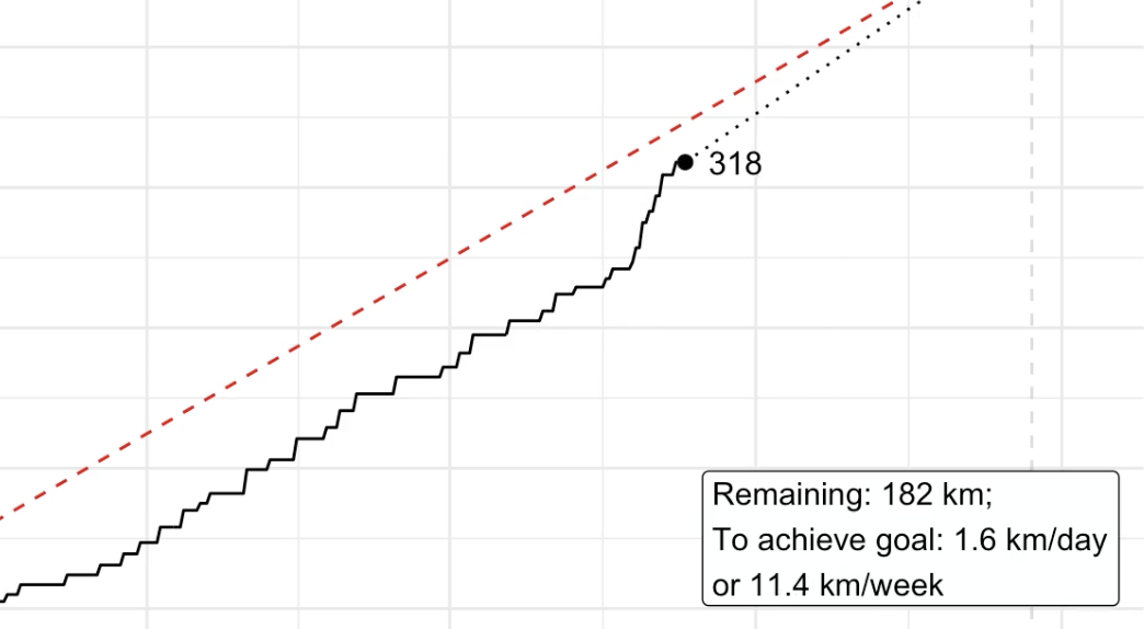
Picking up the pieces Recently, I’ve animated a specific running goal for one year with data from the Strava API. I thought it would also be nice to compare different years within the same animation - in a way you could say that you’re racing yourself over several years. This only needs some minor modifications to the code I posted before. Data collection stays basically the same, so I’m just re-posting this here.
'Running through the fields, lying flat on the ground': Animating 2020 running goals

'Running through the fields, lying flat on the ground': Animating 2020 running goals

Full disclosure: I did not even have any running goals for 2020. But as it turned out: It has been a good year for running - at least one thing this year was good at. In this post, I want to run you through my R script which creates an animated graph that looks like I had the goal of running 500 kilometres this year (spoiler: I didn’t). This is what the finished graph looks like (for 2020-12-23):