‚Stata-like‘ tick marks for logarithmic axes in ggplot2
I am currently reproducing a statistical analysis a colleague of mine conducted in Stata. Obviously, I am using R for the replication. I came across what I think is Stata’s default behavior when using log-transformed axes. This is an example. What I like about the tick lines on the axes here is that they show the “distortion” that is introduced by the logarithmic transformation. In other words: Distances between the non-transformed values shrink as we reach higher values and the tick marks show just that. I wanted to reproduce this with R and ggplot2 which does not behave like this by default.
tl;dr
If you just want to know how to do this, check out ?annotation_logticks. Yes, ggplot2 actually comes with a pre-build function to do (almost) exactly this.
Long answer
Creating a sample dataset
First, I am creating a sample dataset. I am using a randomly sampled Zipf-Mandelbrot distribution. This is how the frequencies of word types in large text collections are distributed almost always. Basically, what we do now is setting up a “large number of rare events” (lnre) model with specific parameters and create a random dataset from that model.
library(zipfR)
set.seed(42)
ZM <- lnre("zm", alpha = 2/3, B = 0.1)
random.zipf <- as.numeric(as.character(rlnre(ZM, n = 10^6)))
We now create a frequency table and transform it into a dataframe. Then, we’re creating a column holding the rank of the specific “word” in the frequency list.
df <- as.data.frame(sort(table(random.zipf), decreasing = T))
df$rank <- 1:nrow(df)
head(df)
## random.zipf Freq rank
## 1 1 86945 1
## 2 2 67721 2
## 3 3 54870 3
## 4 4 45388 4
## 5 5 38409 5
## 6 6 32959 6Creating the plots
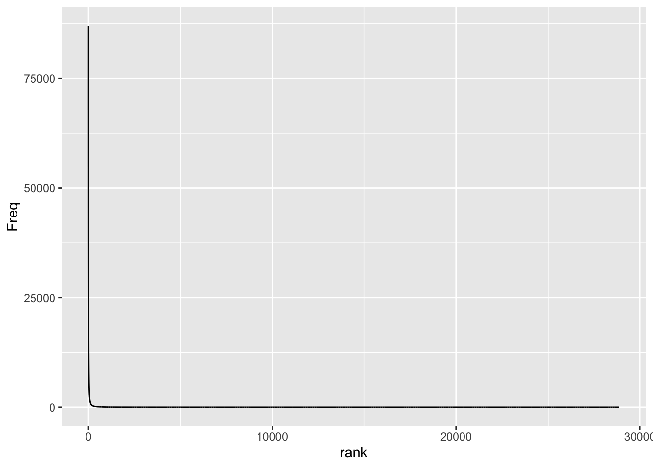
I will build the final plot step by step and show you the intermediate results. I begin by creating a “normal” ggplot plotting the rank of an item (x-axis) against its frequency (y-axis).
library(ggplot2)
p1 <- ggplot(df, aes(x = rank, y = Freq)) +
  geom_line()
p1
That’s exactly what we expect from a Zipfian distribution. Basically, there’s just an “L”, meaning we have very few high-frequency items and a lot of low-frequency items - the distribution has a “long tail”. The first thing we want to do is create a “log-log plot”, i.e. we are transforming both axes. Also, I am using the comma formatting function from the scales package for the axes.
library(scales)
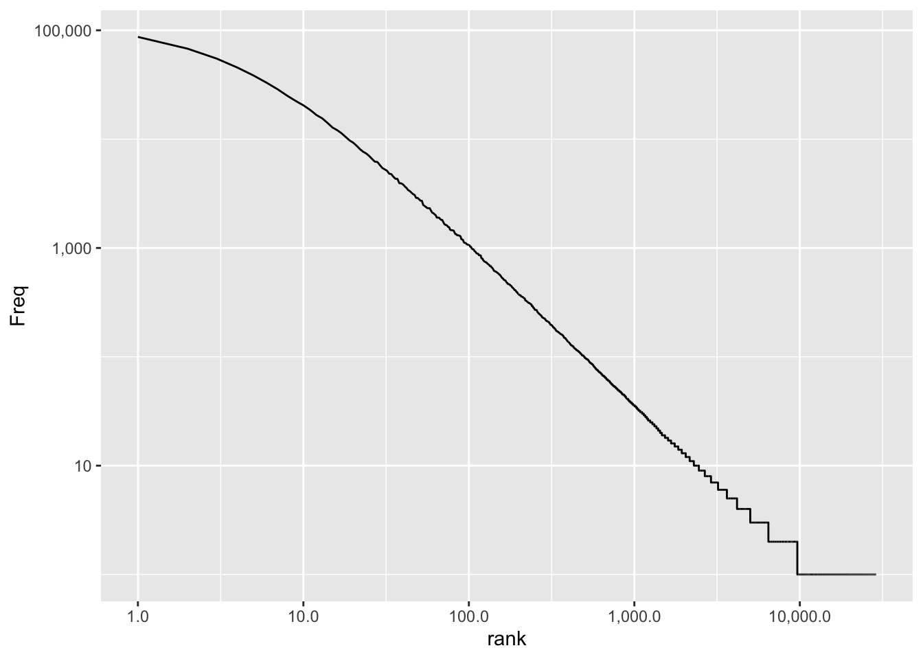
p2 <- p1 + scale_y_log10(labels = comma) + scale_x_log10(labels = comma)
p2
This worked. The logarithmic transformation of the axes lead - one might say - to an “enhanced resolution” where we can actually see the (almost linear) relationship between the log(rank) and the log(frequency) of an item. We could actually be happy with this result but the whole point of this post is to show you the “Stata-like” tick marks.
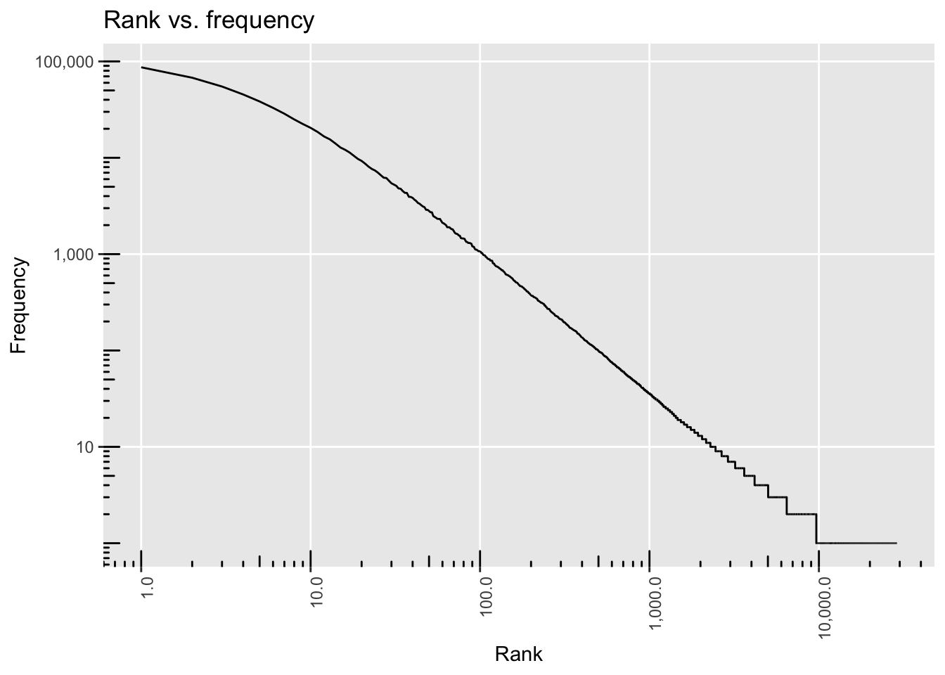
We add the logticks with annotation_logticks() and suppress the minor grid lines because they don’t line up with the log-ticks.
p2 + annotation_logticks() +
  theme(panel.grid.minor = element_blank(),
        axis.text.x = element_text(angle = 90, hjust = 1)) +
  labs(x = "Rank", y = "Frequency", title = "Rank vs. frequency")
As you can see, there is a subtle difference compared to log scales as used by Stata, namely the tickmarks reaching into the panel and not being attached outside of the axes. I have not found an easy solution to change this, though. There might be some ggplot2 “hacks” but these do not look very straightforward to me. In case you’re interested, you can check out this post by Burgess Freeman or this question by Ben Bolker and the thread that goes with it.
Alright, see you next time!

