Using custom scales with the ‚scales‘ package
Maybe you already heard of the package “scales” - and if you didn’t hear about it, you might have used it without knowing (e.g., in the context of ggplot2 graphs). I want to show you a few of the functionalities of the “scales” package. I will also show you how to create your own scales. There are several possible reasons why you might want to use these:
- Automatically create axis labels that show percentages (
0.258>25.8%) if you have percentage values in your data. - Use axis labels for large numbers that are more readable (
156810>156,810). - Create your very own scale, for example showing thousands simply as “k” (
35000>35k), the “plotly” package does exactly that by default. - Creating transparent colors very easily without having to remember the hex codes for the alpha channel.
There is a lot more stuff you can do with the “scales” package. I will concentrate on the applications listed above.
Creating some sample data
I start by creating a dataset. In column data$x, there will be 200 values sampled between 0 and 1. In column data$y, I am creating a variable that is correlated with x. By adding normally distributed values to the perfect relationship of y = x * 10000, the relationship gets noisier. This noise is produced by the rnorm(200, 3000, 5000) part.
library(ggplot2)
library(knitr) # for 'kable'
library(scales)
set.seed(42)
data <- data.frame(x = sample(seq(0, 1, .001),
                              size = 200,
                              replace = T))
data$y <- data$x * 10000 + rnorm(200, 3000, 5000)
kable(head(data))| x | y |
|---|---|
| 0.560 | 3583.957 |
| 0.996 | 22202.410 |
| 0.320 | 2866.133 |
| 0.152 | 5047.569 |
| 0.073 | 1618.721 |
| 0.227 | 4658.249 |
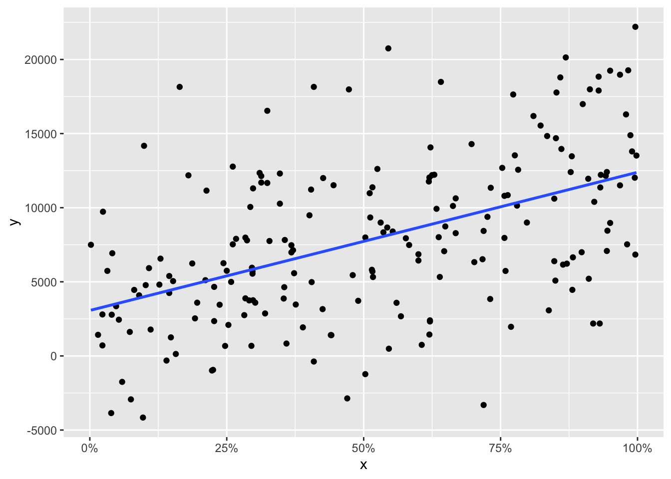
You see: x varies between 0 and 1, and y is somewhere in the range between -10000 and +20000. We can look at the relationship.
ggplot(data, aes(x = x, y = y)) +
  geom_point() +
  geom_smooth(method = "lm", se = F)
## `geom_smooth()` using formula 'y ~ x'
Alright, this worked.
Formatting the labels of the axes
Let’s suppose that x is a percentage value and we want to express this with the tick mark labels on the x-axis. Of course, we could introduce a new column to data which holds x * 100. However, we would still have to deal with the percentage sign. It is much easier to tell ggplot to use the function percent as the labeling function for the continuous x-axis. To do so, we introduce another line to the ggplot:
ggplot(data, aes(x = x, y = y)) +
  geom_point() +
  geom_smooth(method = "lm", se = F) +
  scale_x_continuous(labels = percent)
## `geom_smooth()` using formula 'y ~ x'
And that’s it. Our x-axis is nicely formatted with values between 0 and 100 with a “%” as suffix. But what does the function percent() actually do? As you can see in the next example, it simply takes any numerical value, multiplies it by 100, rounds it, and adds the “%”.
percent(0.1356)## [1] "14%"Interestingly, percent() is just a special case of the more general function number_format(). By using this function, we can easily write our own functions that do arbitrary stuff to our numerical values. For example, I want a function that, roughly speaking, replaces 000 by k, meaning that 1000 gets 1k, 20000 gets 20k and so on. With the following call, I am defining the function ks that does that. In it, I am using the function number_format().
ks <- function (x) { number_format(accuracy = 1,
                                   scale = 1/1000,
                                   suffix = "k",
                                   big.mark = ",")(x) }
Remember that number_format() returns itself a function. That’s why the (x) is all at the back of the function definition. It is the only argument of the function that is returned by number_format().
ks(9000)## [1] "9k"ks(1234000)## [1] "1,234k"ks(2322)## [1] "2k"As you can see, ks() does what it should. But why?
accuracydefines how should be rounded. Note that this changes the accuracy of the value in the last call:2322simply gets2k.scaledefines which value should be multiplied by the original value. In this case, the original value should be divided by 1000. This is the same as multiplying by 1/1000.suffixtells R what to add behind the result (there’s also an argumentprefixin case you want to add something before the new value).big.markintroduces a character between thousands which makes larger values more readable.
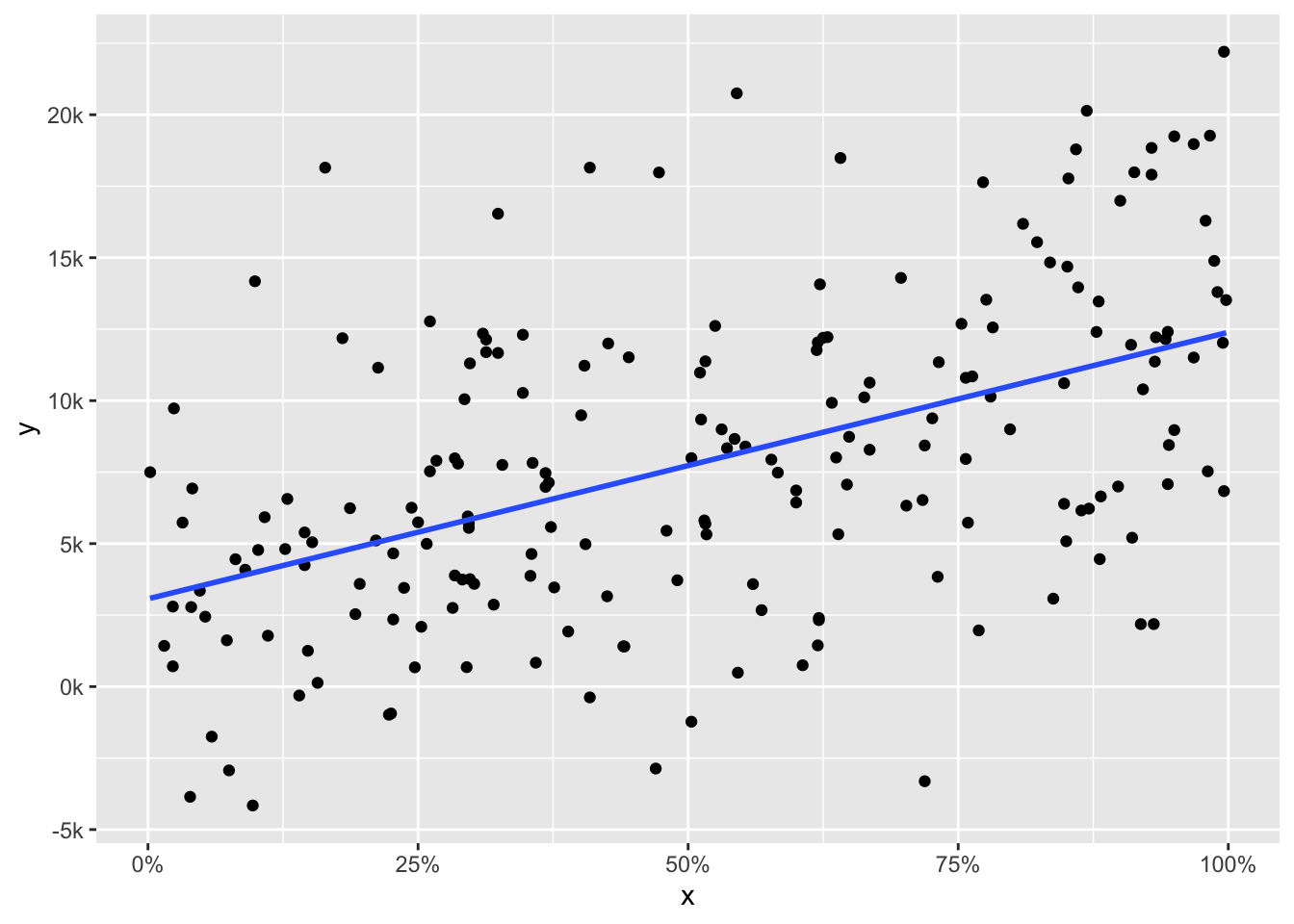
Let’s use this new function as the labeling function for our y-axis.
ggplot(data, aes(x = x, y = y)) +
  geom_point() +
  geom_smooth(method = "lm", se = F) +
  scale_x_continuous(labels = percent) +
  scale_y_continuous(labels = ks)
## `geom_smooth()` using formula 'y ~ x'
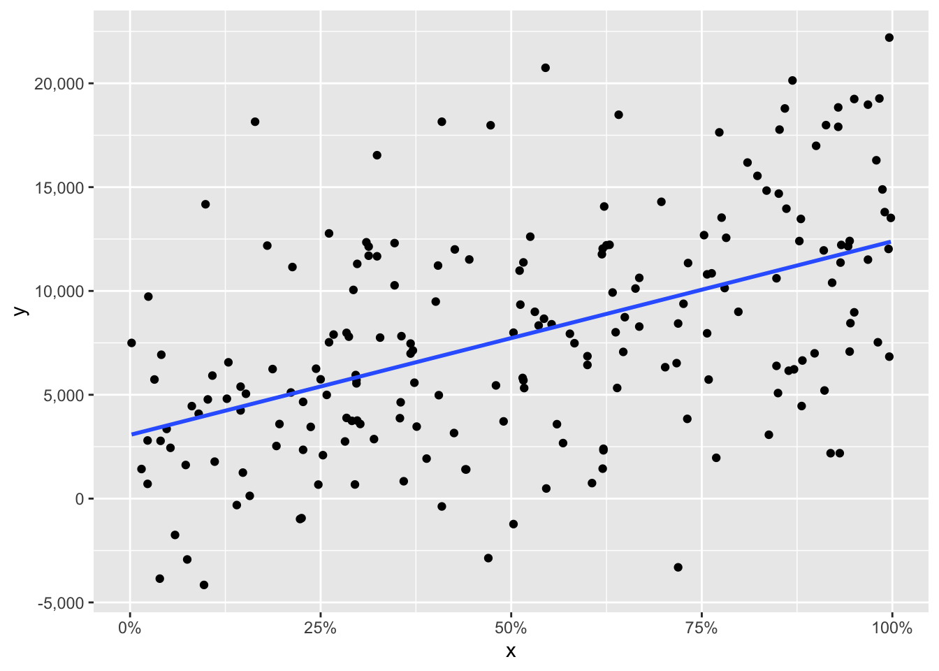
That worked! And just in case you want to see the complete numbers but just format them in a way that is a little more readable, use the function comma().
ggplot(data, aes(x = x, y = y)) +
  geom_point() +
  geom_smooth(method = "lm", se = F) +
  scale_x_continuous(labels = percent) +
  scale_y_continuous(labels = comma)
## `geom_smooth()` using formula 'y ~ x'
comma() really makes sense when you are dealing with large numbers (e.g., corpus sizes in linguistics) and quickly want to see the magnitude of different numbers. See? No need for counting zeroes anymore!
large.vals <- sample(10000000:200000000, 10)
comma(large.vals)
## [1] "76,812,506" "90,947,703" "28,384,382" "179,313,871" "126,583,426"
## [6] "198,167,391" "156,970,121" "166,548,073" "119,490,834" "70,583,212"Transparent colors
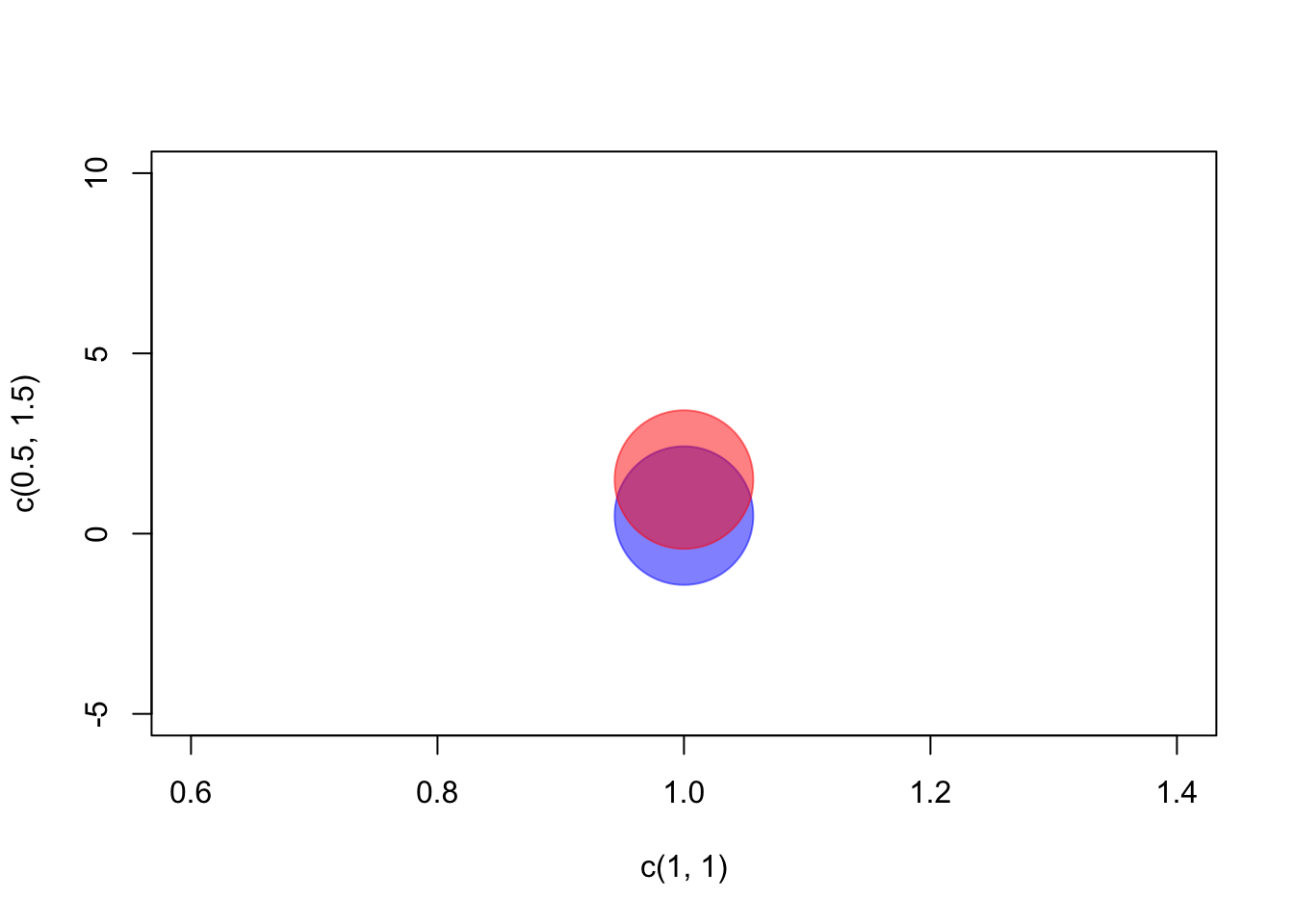
Now to something completely different: when I started using transparent colors in R, I had to remember the hex-value 7F because it stands for 127, which is rougly the half of 255. By defining colors like
half.trans.blue <- "#0000FF7F"
half.trans.red <- "#FF00007F"
I got colors that are half transparent. I used those codes in plots where I needed transparent colors. With the function alpha() from the “scales” package, this is much easier and more straightforward:
plot(c(1, 1), c(0.5, 1.5),
     pch = 19, cex = 10, ylim = c(-5, 10),
     col = c(half.trans.blue, half.trans.red))
plot(c(1, 1), c(0.5, 1.5),
     pch = 19, cex = 10, ylim = c(-5, 10),
     col = alpha(c("blue", "red"), 0.5))
You just give alpha() a vector of colors and a transparency value between 0 and 1 and it calculates the hex codes for you. You can also give it several transparency values if you want your colors to have different transparencies. I really like this and use it a lot. Remember, that you don’t have to load a package to use a function that’s in this package. You could simply use double colons to access a function in a package, e.g. scales::alpha("blue", .5).
As I said: There’s a lot more you can do with the “scales” package. I only described the few functions I am using the most. But please feel free to add other stuff in the comments. Bye!

