So, the Internet Movie Database (IMDb) has some nicely precompiled datasets that even seem to be updated on a daily basis. Let’s put them to good(?) use. We’ll use two files because the file with ratings only has unique identifiers that have to be merged with the actual names. I’ve downloaded these files before, so they might be a bit out of date. I am not doing this here, but it might be easy to modify the vroom() calls below to always get the up-to-date data gzipped files directly from the website.
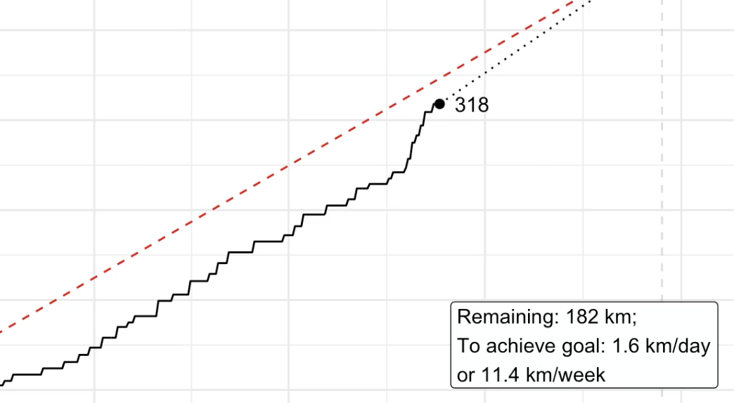
Picking up the pieces Recently, I’ve animated a specific running goal for one year with data from the Strava API. I thought it would also be nice to compare different years within the same animation - in a way you could say that you’re racing yourself over several years.
This only needs some minor modifications to the code I posted before. Data collection stays basically the same, so I’m just re-posting this here.
Full disclosure: I did not even have any running goals for 2020. But as it turned out: It has been a good year for running - at least one thing this year was good at. In this post, I want to run you through my R script which creates an animated graph that looks like I had the goal of running 500 kilometres this year (spoiler: I didn’t). This is what the finished graph looks like (for 2020-12-23):
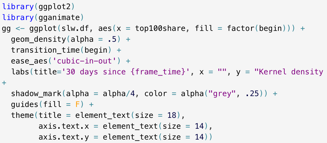
Previously, I’ve plotted a ridgeline based on a variable’s density through time. It might look nice but it’s quite obvious that time can be visualized in a more fitting way - by time itself, in an animated plot that is. So, let’s fire up the {gganimate} package again.
My goal is to show a moving kernel density curve as it moves through time, based on a moving window of 30 days sliding from the past to the present.
I really like ridgeline plots but only recently I have learned how to do them myself. Of course, the most famous ridgeline plot ever is the one you find on the cover of Joy Division’s album “Unknown Pleasures”. I wonder how many ridgeline plots done with the {ggridges} package try to replicate the look of this famous (and great!) album. And - of course - I will try, too.