There is a game I play / try to make myself okay / try so hard to make the pieces all fit / smash it apart / just for the f**k of it (Nine Inch Nails: The Big Come Down)
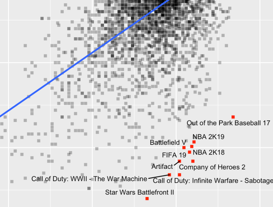
After this rather distressing opening by the Nine Inch Nails, let’s turn to a more uplifting topic: video games! There is a dataset on Kaggle with ratings for over 4000 video games.
What we want to do Recently, I used a correspondence analysis from the ca package in a paper. All of the figures in the paper were done with ggplot. So, I wanted the visualization for the correspondence analysis to match the style of the other figures. The standard plot method plot.ca() however, produces base graphics plots. So, I had to create the ggplot visualization myself. Actually, I don’t know if there are any packages that take a ca object (created by the ca package) and produce ggplots from it.
Previously, when Rcrastinate was still on blogspot.com, I had a first look at ten years of my playback history on Last.FM. But there is still a lot one can do with this dataset. I wanted to try {gganimate} for a long time and this nice longitudinal dataset gives me the opportunity.
Loading and preparing the data First, I am loading the dataset. I already did some preparations like extracting the top five tags for each track and some other stuff I used in my previous entry.
I am currently reproducing a statistical analysis a colleague of mine conducted in Stata. Obviously, I am using R for the replication. I came across what I think is Stata’s default behavior when using log-transformed axes. This is an example. What I like about the tick lines on the axes here is that they show the “distortion” that is introduced by the logarithmic transformation. In other words: Distances between the non-transformed values shrink as we reach higher values and the tick marks show just that.