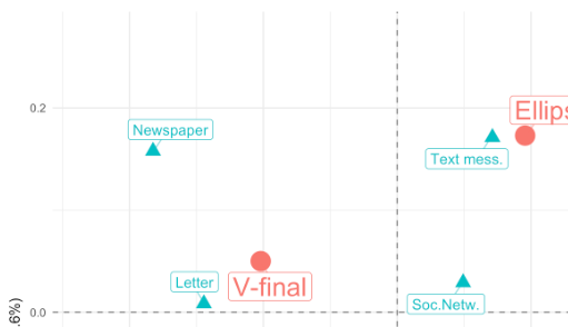
What we want to do Recently, I used a correspondence analysis from the ca package in a paper. All of the figures in the paper were done with ggplot. So, I wanted the visualization for the correspondence analysis to match the style of the other figures. The standard plot method plot.ca() however, produces base graphics plots. So, I had to create the ggplot visualization myself. Actually, I don’t know if there are any packages that take a ca object (created by the ca package) and produce ggplots from it.
What I will show you In this post, I want to show you a few ways how you can save your datasets in R. Maybe, this seems like a dumb question to you. But after giving quite a few R courses mainly - but not only - for R beginners, I came to acknowledge that the answer to this question is not obvious and the different possibilites can be confusing.
Previously, when Rcrastinate was still on blogspot.com, I had a first look at ten years of my playback history on Last.FM. But there is still a lot one can do with this dataset. I wanted to try {gganimate} for a long time and this nice longitudinal dataset gives me the opportunity.
Loading and preparing the data First, I am loading the dataset. I already did some preparations like extracting the top five tags for each track and some other stuff I used in my previous entry.
I am currently reproducing a statistical analysis a colleague of mine conducted in Stata. Obviously, I am using R for the replication. I came across what I think is Stata’s default behavior when using log-transformed axes. This is an example. What I like about the tick lines on the axes here is that they show the “distortion” that is introduced by the logarithmic transformation. In other words: Distances between the non-transformed values shrink as we reach higher values and the tick marks show just that.
Maybe you already heard of the package “scales” - and if you didn’t hear about it, you might have used it without knowing (e.g., in the context of ggplot2 graphs). I want to show you a few of the functionalities of the “scales” package. I will also show you how to create your own scales. There are several possible reasons why you might want to use these:
Automatically create axis labels that show percentages (0.